


The birth of the brand
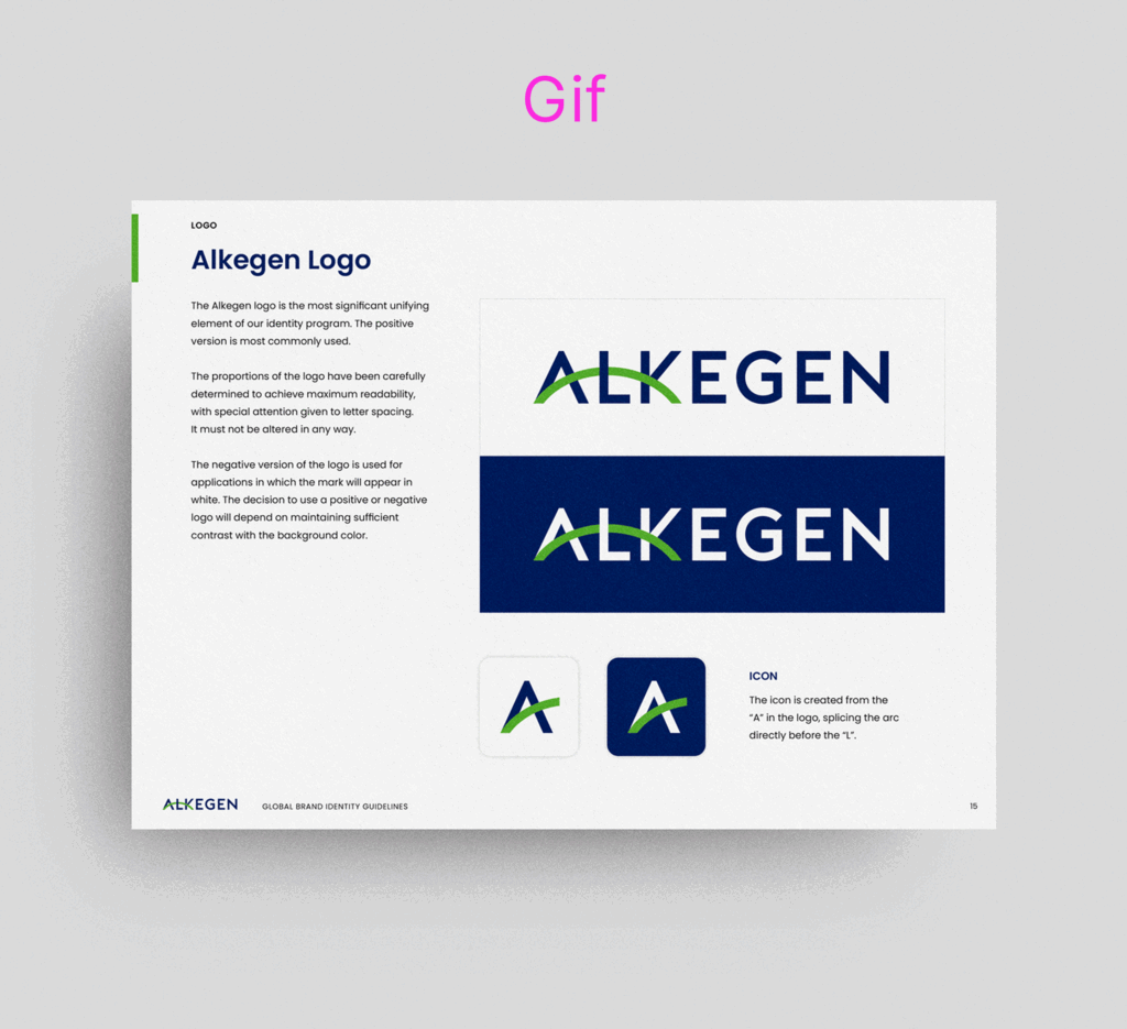
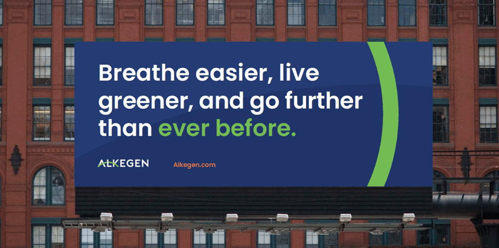
Soon enough, a logo that could be easily translated across Alkegen’s global workforce took shape. The key element “Alkegen Arc” rendered in the brand’s signature green represents a bridge from today’s technology to a brighter, cleaner future. The instantly iconic arc was quickly put to work across a range of touch points and symbolizing several meanings such as a connection, or bridge between two materials or from material to end-user.
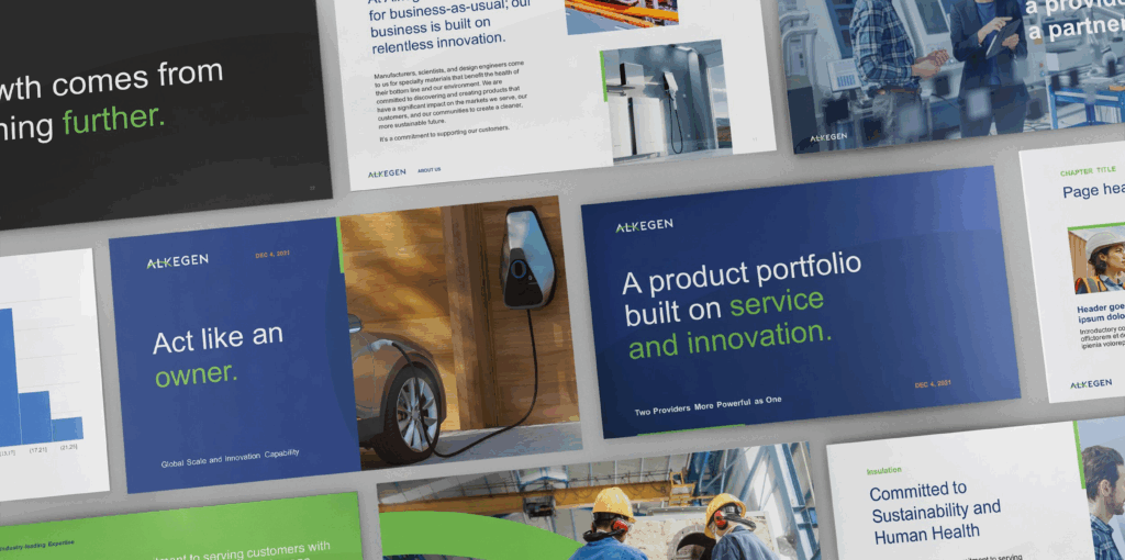
The brand guidelines were built in real time as we simultaneously designed the trade show booths, announcement and sales videos — and, most importantly, the website.
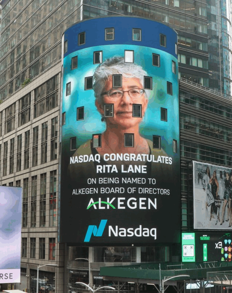
It was a tall order but made possible with lock-step collaboration. In the end we had a strong brand that is modern yet timeless and has the power and simplicity to be understood and loved by employees on all seven continents. We even made it to Times Square.